可视化
默认以index为x轴,以index对应数据为y轴,也可通过x,y参数指定
kind:表示绘图的类型,默认为line,折线图
- line:折线图
- bar/barh:柱状图(条形图),纵向/横向
- pie:饼状图
- hist:直方图(数值频率分布)
- box:箱型图
- area:区域图(面积图)
- scatter:散点图
- hexbin:蜂巢图
1
2
3
4
5
6
7
|
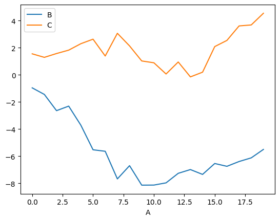
ts = pd.Series(np.random.randn(20), index=pd.date_range("1/1/2000", periods=20))
ts.plot.line()
df = pd.DataFrame(np.random.randn(20, 2), columns=["B", "C"]).cumsum()
df["A"] = pd.Series(list(range(len(df))))
df.plot(x="A", y=[*"BC"])
|
1
2
3
4
5
6
7
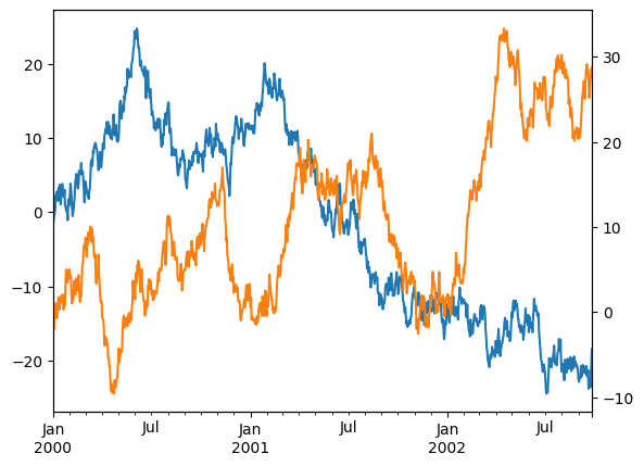
| ts = pd.Series(np.random.randn(1000), index=pd.date_range("1/1/2000", periods=1000))
df = pd.DataFrame(np.random.randn(1000, 4), index=ts.index, columns=list("ABCD"))
df = df.cumsum()
print(df)
df.A.plot()
df.B.plot(secondary_y=True)
|
1
2
3
4
5
6
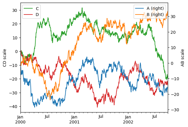
| ax = df.plot(secondary_y=["A", "B"])
ax.set_ylabel("CD scale")
ax.right_ax.set_ylabel("AB scale")
ax.legend(loc="upper left")
ax.right_ax.legend(loc="upper right")
|
1
2
3
4
|
df.A.plot(color='red')
df.B.plot(color='blue')
df.C.plot(color='yellow')
|
条形图bar
1
2
3
4
5
6
7
| df2 = pd.DataFrame(np.random.rand(10, 4), columns=["a", "b", "c", "d"])
df2.plot.bar()
df2.plot(kind="bar",stacked=True).legend(loc="upper right")
df2.plot(kind="barh")
|
1
2
3
4
| import matplotlib.pyplot as plt
plt.rcParams["font.family"] = ["SimHei"]
plt.rcParams["axes.unicode_minus"] = False
|
折线图plot
1
2
3
4
5
6
7
8
9
10
11
12
13
14
15
16
17
18
19
20
21
22
23
24
25
26
27
28
29
30
31
32
33
34
35
36
37
38
39
40
| import matplotlib.pyplot as plt
from matplotlib import rcParams
rcParams["font.family"] = "SimHei"
rcParams["font.size"] = "12"
plt.figure(figsize = (10,5))
plt.title("销售趋势",color="red",fontsize=18)
months = [f"{_}月" for _ in "1234"]
sales = [100,150,80,130]
plt.plot(months,sales,label="产品A",color="orange",linewidth=3,linestyle="--",marker="o")
plt.grid(axis="y",alpha=0.3,color="blue",linestyle="--")
plt.xticks(rotation=30,fontsize=12)
plt.yticks(rotation=90,fontsize=12)
plt.xlabel("月份",fontsize=16)
plt.ylabel("销量(万元)",fontsize=16)
plt.ylim(0,200)
for x,y in zip(months,sales):
plt.text(x,y+1,str(y),ha="center",va="bottom",fontsize=10)
plt.legend(loc="upper left")
plt.show()
|
柱状图bar(h)
1
2
3
| plt.bar(subjects,scores,label="学生A",color="orange",width=0.3)
plt.barh(subjects,scores,label="学生A",color="orange",height=0.4)
|
饼图pie
1
2
3
4
5
6
7
8
9
10
11
12
13
14
15
16
17
| letters = [*"ABCD"]
values = [10,20,5,15]
explode = [0.1,0,0,0]
plt.pie(
values,
explode=explode,
labels=letters,
autopct="%.1f%%",
startangle=90,
wedgeprops={"width":0.6},
pctdistance=0.7,
shadow=True,
)
plt.text(0,0,"总计:\n100%",ha="center")
|
散点图scatter
1
| plt.scatter(x,y,color="blue",alpha=0.5,s=10)
|
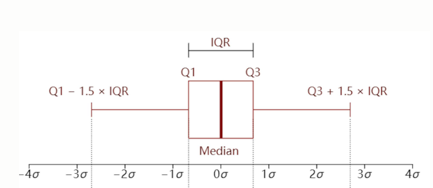
箱型图boxplot
箱子的中线代表中位数
箱子的上边缘和下边缘代表上四分位数(0.75)和下四分位数(0.25)
箱子外侧的上下延伸线端点位置代表极端值的阈值,上端点为上四分位数加上1.5 倍的上、下四分位数之差,记作w_high ,下端点为下四分位数减去1.5 倍的上、下四分位数之差,记作w_low
极端异常值会用空心小球标记
1
2
3
4
5
6
7
| data = {
"语文":np.random.randint(60,100,10),
"数学":np.random.randint(60,100,10),
"英语":np.random.randint(60,100,10),
}
plt.boxplot(data.values(),tick_labels=data.keys())
|
多个图表绘制
1
2
3
4
5
6
7
8
9
10
11
| f1 = plt.subplot(2,2,1)
f1.plot(months,sales)
f2 = plt.subplot(2,2,2)
f2.bar(months,sales)
f3 = plt.subplot(2, 2, 3)
f3.barh(months, sales)
f4 = plt.subplot(2, 2, 4)
f4.scatter(months, sales)
|
分类数据
1
2
3
4
5
6
7
8
9
10
11
12
13
14
|
s = pd.Series(["a", "b", "c", "a"], dtype="category")
s
'''
0 a
1 b
2 c
3 a
dtype: category
Categories (3, object): [a, b, c]
'''
pd.Series([1, 2, 3]).astype(CategoricalDtype([3, 2, 1], ordered=True))
|
pd.Categorical
1
2
3
4
5
6
7
8
9
10
11
12
13
| raw_cat = pd.Categorical(["a", "b", "c", "a"],
categories=["b", "c", "d"],
ordered=False)
s = pd.Series(raw_cat)
'''
Out[12]:
0 NaN
1 b
2 c
3 NaN
dtype: category
Categories (3, object): [b, c, d]
'''
|
1
2
3
4
5
6
7
8
9
10
11
12
13
14
| ser = df['team'].astype("category")
ser.cat.categories
ser.cat.ordered
fact = pd.factorize(df['team'],sort=True)
(fact[0]==ser.cat.codes.values).all(),(fact[1]==ser.cat.categories).all()
ser.cat.codes
|
追加/删除/更改类别
1
2
3
4
5
6
7
8
9
10
11
12
13
14
| s = pd.Series(["a", "b", "c", "a"], dtype="category")
s.cat.add_categories(["d"])
s.cat.remove_categories(["c"])
s.cat.remove_unused_categories()
s.cat.set_categories([*"abc"])
ser.cat.rename_categories({"E":'e'})
|
有序类别
1
2
3
4
5
6
7
8
9
10
11
|
ser.cat.reorder_categories([*"EDCBA"],ordered=True)
ser.cat.as_unordered()
ser.cat.as_ordered()
ser.cat.reorder_categories([*"EDCBA"],ordered=True)>="A"
|
分类数据操作
对比
- 相等性(
==和!=)与长度与分类数据相同的类似列表的对象(列表,序列,数组等)进行比较
- 当
ordered == True 并且类别相同时,分类数据与另一个分类系列的所有比较(==,!=,>,> =,<和<=)
- 分类数据与标量(标量必须在分类数据中)的所有比较
1
2
3
4
5
6
7
8
9
10
11
12
13
14
15
16
17
18
19
20
21
22
23
24
25
26
27
28
29
30
31
32
33
34
35
36
37
38
39
40
41
42
43
| cat = pd.Series([1, 2, 3]).astype(CategoricalDtype([3, 2, 1], ordered=True))
cat_base = pd.Series([2, 2, 2]).astype(CategoricalDtype([3, 2, 1], ordered=True))
cat_base2 = pd.Series([2, 2, 2]).astype(CategoricalDtype(ordered=True))
cat > cat_base
'''
0 True
1 False
2 False
dtype: bool
'''
cat > 2
'''
0 True
1 False
2 False
dtype: bool
'''
cat == cat_base
'''
0 False
1 True
2 False
dtype: bool
'''
cat == np.array([1, 2, 3])
'''
0 True
1 True
2 True
dtype: bool
'''
cat == 2
'''
0 False
1 True
2 False
dtype: bool
'''
|
操作
1
2
3
4
5
6
7
8
9
10
11
12
13
| s = pd.Series(pd.Categorical(["a", "b", "c", "c"],
categories=["c", "a", "b", "d"]))
s.value_counts()
'''
c 2
b 1
a 1
d 0
dtype: int64
'''
s.groupby(s.values).count()
|
习题链接
案例
练习题